

Best Startup Homepages: 20 Branding Examples
- Mar 24
- 9 min read
Updated: Apr 23

First impression or only impression? That's the difference between websites that leave a memorable mark and ones that miss the mark by a Mississippi country mile.
(that's far, Johnny.)
Creatively, the best startup websites turn their mission, product, and brand into one decidedly distinctive portrait. If your customer were walking into a startup branding gallery and saw your homepage on the wall, there'd be no confusing your Mona Lisa with the millions of imitations.
The best startup brand homepages do four things:
They address the elephant in the room: answering the big question relevant to their product category.
They rewrite their positioning statement into a marketable tagline that's easy to say and remember.
They position against the competition with a differentiator that speaks to underserved audiences.
They let prospects know they're number one. If not, they stake their claim as a 'fan favorite' or 'beloved brand' in the category.
If successful, a good startup homepage can help set the standard for the entire marketing program.
Keep reading for 20 great homepages.
20 great homepages from the world's hottest startups.
Jump to a homepage
Who Gives A Crap
Seapoint
Ritual Zero Proof
Policygenius
Heura
ClickUp
DASH Water
Anthropic
Ramp
Whatnot
Glean
Givebutter
Lumos
Just
Calm
Whiny Baby
Too Good To Go
Planet A Foods
Magic School
Light Phone
1. Who Gives A Crap

This popular toilet paper startup (yes, toilet paper startup) has become known for its marvelous marketing messaging.
As a brand who puts memorability before jargon, Who Gives A Crap avoids the mistake made by startups who simply sell product features. Instead, they convey their brand promise without compromising messaging memorability.
For example, Who Gives A Crap takes their two product features:
100% bamboo & recycled toilet paper helps reduce deforestation.
50% of profits are donated to help build toilets.
And translates them into "A really easy way to do good."
But, it's not just the promise for impact that makes this messaging outstanding. It's how the juxtaposition turns what would be a cliché statement into something unexpected. Because what person associates doing good with wiping your a**?
Umm... no one.
2. Seapoint

I love when a startup screams to its audience from the rooftops. It's like that hero in the Hollywood rom-com leaving their heart all on the line.
In this story, "Your startup's financial home," is Seapoint's poignant line.
Unlike millions of marketing headlines, Seapoint's isn't just homepage fodder. Something to be cut or replaced when the marketing seasons change. It's their forever positioning: the same message that can be found in all of Seapoint's marketing, on every channel, for every customer.
If you want simplify. If you want to bring your marketing team together on one page. Ask yourself like Seapoint, "How can I turn my startup positioning statement into a marketable tagline?"
Great work here by founder Sean Mullaney and his marketing team.
3. Ritual Zero Proof

This is a great example of a market leader homepage.
If you hope to be a true market leader, someone who wants to earn the respect and attention of the marketplace, your startup brand marketing must never leave doubt about who's number one.
As an early mover in zero-proof alcohol, capturing a large share of the market, this leadership positioning is Ritual's best sell. In an industry where people are resistant to change and sensitive about taste, buyers are more likely to trust the product that people buy... well... more.
But on top of that, even Ritual's sub headline, "Your favorite cocktails made non-alcoholic," is smart marketing. Because instead of starting from scratch, Ritual hijacks nostalgia.
After all, sober drinkers don't want Ritual as much as they want the taste of what they used to enjoy.
That's brand self-awareness.
4. Policygenius

You can always do this Policygenius homepage approach. Or what I call the When-All-Else-Fails-Just-Say-This website strategy.
For example, "The simple way to buy insurance," says Policygenius. They're saying what they do in layman's terms. This works because they're in a very traditional product category (insurance shopping). So it's a refreshing juxtaposition.
But keep in mind, you don't want to just describe what you do. Any homepage can do that. Your job is to layer your messaging with product positioning.
In the case of Policygenius, they're contrasting against what buyers hate about insurance: the complicated shopping experience.
5. Heura
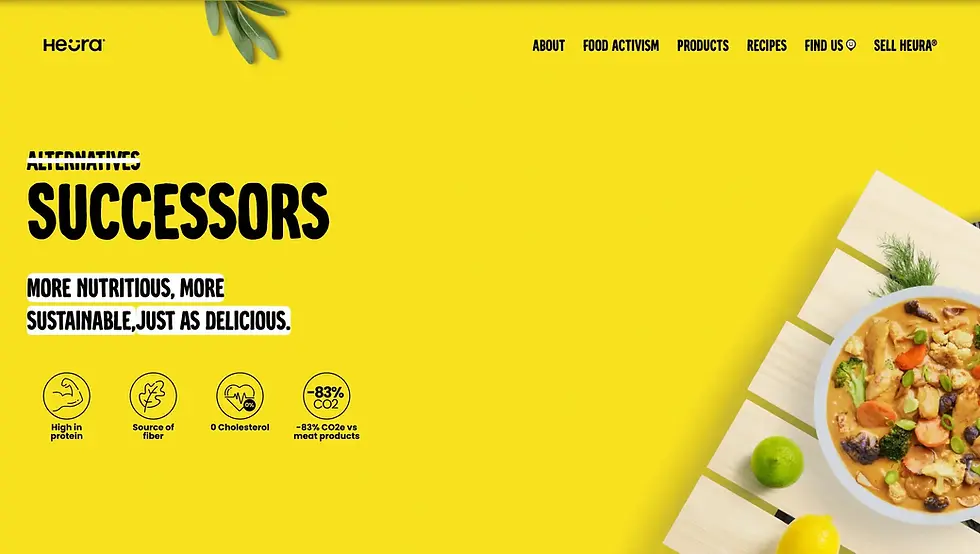
In the case of the plant-based meat brand, Heura, when an entire industry goes one way, it's time to go the other.
"Alternatives. Successors."
That's brilliant.
The marketing team at Heura has pretty much put themselves in a league of 1 with this new category-creating line. Enough said.
(Did I say this was brilliant?)
6. ClickUp

ClickUp is playing the "How can we be as relevant as possible?" game. And I'd say it's working.
This is a great example of a brand homepage consciously choosing the most universal, ambitious problem affecting its customer base.
A more corporate, less savvy team of ClickUp marketers would've gone the other way. But they, by way of a marketing miracle, have resisted tech's great temptation to vomit from the mouth about software, trending tech buzzwords, or pivoting to AI (like the other cyborgs).
This ClickUp line: "Maximize human productivity," is a way to make your product as relevant as possible.
7. DASH Water

DASH Water is a sparkling water startup. If you go to their homepage, you can feel a century's worth of sugary soda disappointment evaporating into thin air. All you had to do was read their headline.
"Finally, a drink to feel good about."
It's also DASH's slogan. It's a great example of how seven words can put you into the shoes of an underserved audience. In the case of DASH, that's the 'anti-Big Soda,' health-savvy consumer.
Whenever a brand like this moves into a category dominated by giant establishments such as Coca-Cola or Pepsi, opportunity is lurking when choice isn't available. The success of DASH comes from meeting that lack head-on with their marketing messaging.
This website is proof of that.
8. Anthropic

Always address the elephant in the room. That's Anthropic's homepage in a nut shell. It'd be easy for them to talk about how AI will change the world. But most people are privy to that fact.
Anthropic's positioning protects against the one thing that threatens the adoption of most new technology: fear.
"AI research and products that put safety at the frontier," says Anthropic's homepage header.
World-changing impact is nearly a given for Anthropic. But confronting the dangers of AI as it relates to humans? That brings calm to cautious consumers.
9. Ramp

Ramp's doing what I call "The You Talkin' To Me Principle."
It's one of our original principles of Startup COMMS & Marketing, where you take a famous line in pop culture and you turn it on its head, reframing it in a way that's relevant to the product.
"Time is money. Save both," says Ramp's headline.
The former sentence everyone has heard four billion times. The latter is how you pay it off in a new way distinctive to Ramp.
If you want to hack messaging memorability. I suggest trying "The You Talkin' To Me Principle."
10. Whatnot

You can consider this a first-mover homepage. Whatnot is an example of a product being first-to-market. When you're first in your category, you have the luxury of ignoring the competition completely as you simply sell the category (Positioning: Battle For Your Mind by Jack Trout & Al Ries).
"The Live Shopping Marketplace," is how Whatnot sells it. Because this appeals to a big, broad audience base, keeping everything universal is best.
"Shop, sell, and connect around the things you love," says the subhead.
Meanwhile, showing proof of concept with Whatnot screen grabs. As well as including the QR code is a great way for the marketing team not to overthink this.
If you ever feel you've over explained your concept, come back to this Whatnot example.
11. Glean
Click the video for 14 seconds of what Glean's doing with their homepage. It's very nice.
Glean is positioning as "Work AI." They double down here by making it clear that their AI Assistants and Agents work for EVERY employee. Plus, the animated visual is an ideal way to pull this off from a design perspective.
For buyers shopping around in this space, this homepage develops strong brand distinction for Glean.
12. Givebutter

Givebutter's marketing team deserves a pay bump. If you want to talk about knowing your audience. If you want an example of what it means to inspire the dreams of your customer, look no further.
"Your home for changing the world," is all-world copywriting.
It doesn't matter who you are. Whether a founder, fundraiser, or marketer, Givebutter makes you feel like the hero in your nonprofit story.
This positioning could've been a lot less exciting. But Givebutter's decision to lead with such charisma and emotional appeal is what makes this homepage so undeniably memorable.
13. Lumos

If you're moving into a new category. If you're staking your flag in a niche industry. Voila. This Lumos homepage is for you.
Just like Whatnot (#10), they're a first-mover product. Therefore, Lumos can ignore the competition and simply sell the category.
"The Autonomous Identity Platform," says the feature header.
But look closer. It's the simple word - "The" - which shouldn't be underestimated. In a tagline like this, it's important subtext. It's communicating Lumos autonomous identity as 'the one, the only, the original standard of the industry.'
This is a charismatic example of how to confidently communicate your position as market leader.
14. Just

Discipline. That's exactly what Just's homepage is: a masterclass in startups COMMS discipline.
I mean can we "Just" (terrible I know) take a second to admire this three-word positioning?
In a young category, with many competitors and many diverse products, it's best to find your slice of the plant-based pie. Just is an example of doubling-down on a positioning strategy and committing to a lead product (plant-based eggs).
As the number one selling egg alternative, their slogan is an iteration of this homepage tagline: Eggs from plants → Really good eggs, from plants.
This is one of the best examples of fanatically focused messaging.
15. Calm

Calm is now a mature company, but I wanted to include them because of their marketing's play on their name (brand distinction).
If you count the logo, their name "Calm" appears five times. Apple is famous for this, too. If you have a great universal name, make it part of the marketing.
Case in point, their slogan: "Calm your mind. Change your life," is a great example.
And on a finer copywriting note, what makes this tagline really hit is its contrasting effect.
Calm your mind is a simple act.
Change your life is a profound result.
Great marketing messaging is in the details.
16. Whiny Baby

Whiny Baby was just acquired by Gallo (one of America's major wine portfolios). Their founder, Jess Druey is doing big things.
Her brand. Her homepage. Her vibe. It feels so very, very Gen Z. And that's exactly the purpose of Whiny Baby.
The goal of Druey's brand is to introduce the "next gen" to what's always been a traditionally uptight, intimidating category. "Do I really have to hold the glass by the stem?" says the Gen Z-er.
Hell. To. The. No.
Whiny Baby is a progressive example of how important it is to shatter branding barriers if you want to make your audience feel comfortable.
17. Too Good To Go

This kind of headline plays on loop in your mind long after you've left the website. "Save good food from going to waste," says Too Good To Go.
Whenever you have a chance to bring alliteration into your marketing messaging, you can give your prospect's brain something to latch onto. It's like a shortcut to memorability.
An inexperienced marketer easily could've opted for a harder-to-remember descriptor line, putting more work on the reader. This memorable message helps set the standard for Too Good To Go's marketing program.
18. Planet A Foods

Plant A Foods is speaking to food conglomerates. A very traditional, very corporate audience.
If Planet A Foods wants to catch "The Big Fish," like century-old food brands, they must speak, feel, and look like a major food supplier.
That's not surrendering to the status quo, that's reading the room so you can sell your product. For example, "Future-proof, resilient food ingredients" maintains that corporate tone these buyers feel comfortable with.
Only by meeting the food industry where it's at—can Planet A Foods fulfill their mission of "building the next generation of ingredients."
19. Magic School
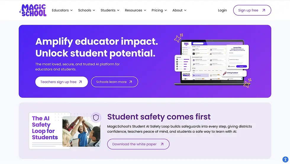
If you've read all these examples, and you're like "Sh*t... I still don't what to write on my homepage..." mimic Magic School.
They answer the big question. The one teachers and parents have been seeking since cavemen-and-women decided it was time to get their little runts out of the cave.
'How do we unlock student potential?' asks Magic School.
To this audience, that's like saying "bomb" on an airplane. (You'll have everyone's attention.)
Magic School's homepage also uses "The Elephant In The Room Principle." They address the one thing that comes to mind when the conversation turns to school and AI. And that's student safety.
A+ for Magic School.
20. My Stupid For Startups Favorite: Light Phone

Light Phone is taking on big tech like Apple.
With marketing messaging like "less features, more life," they're positioning as the alternative to smart phones. Functionally, they're filling an open maket need: a "dumb phone" that doesn't control our lives.
This ultra-minimalistic homepage captures the product's essence perfectly. All you see is blue skies, cotton candy clouds, and a customer testimonial which states "I love this phone. It will make you a happier, more present person."
Light Phone is a standout example of a brand finding the gap in a market. But what makes their marketing memorable is their strategic choice to design branding that doubles down on their 180-degree solution.
Beautiful.
How to make your startup's homepage great?
Remember our "four core" for a great startup homepage:
Address the elephant in the room: answer the big question relevant to your product category.
Adapt your positioning statement into a marketable tagline.
Always position against the competition with a differentiator that speaks to the underserved.
If you're number one, let prospects know. If not, stake your claim as a 'consumer's top choice.'
DON'T FORGET: If there's concerns about your new technological advancement pillaging villages, destroying humanity, and taking over the world. Address it, and get ahead of it in your startup COMMS & marketing.
Dear John, that's all she wrote.
Until next time.

Don't hate my Stupid For Startup content?
Connect with me personally on — My LinkedIn.


